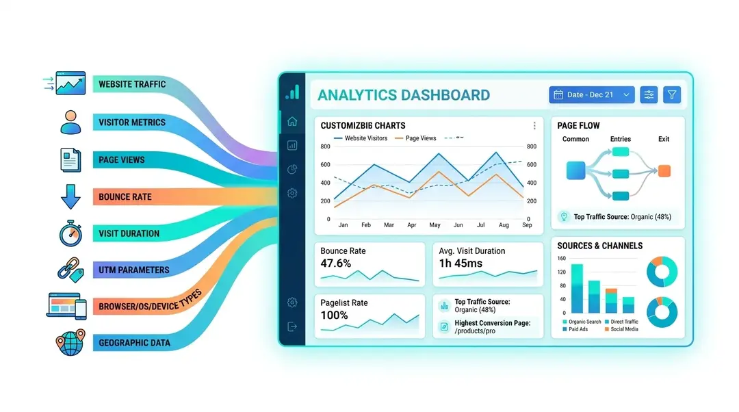
Your Analytics at a Glance
Once your tracking code is installed and visitors start coming in, EuroMetrics collects and organizes everything into a clean, actionable dashboard. Let’s walk through every section so you know exactly what you’re looking at.
The Overview Dashboard
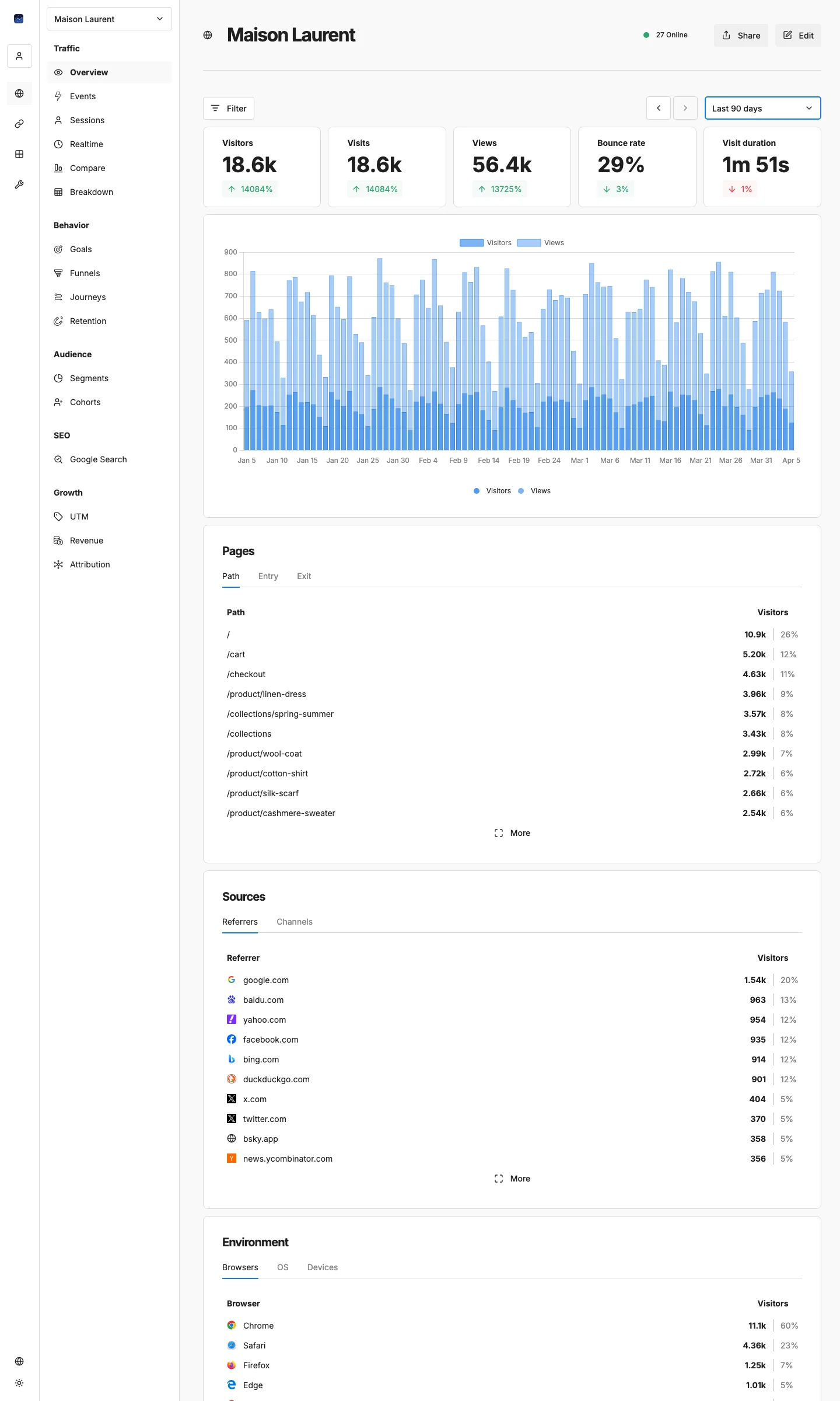
Click on any website from your Websites list to open its analytics. The Overview tab is selected by default. This is your command center.
Key Metrics Bar
At the very top, you’ll see five metric cards that summarize your website’s performance for the selected time period:
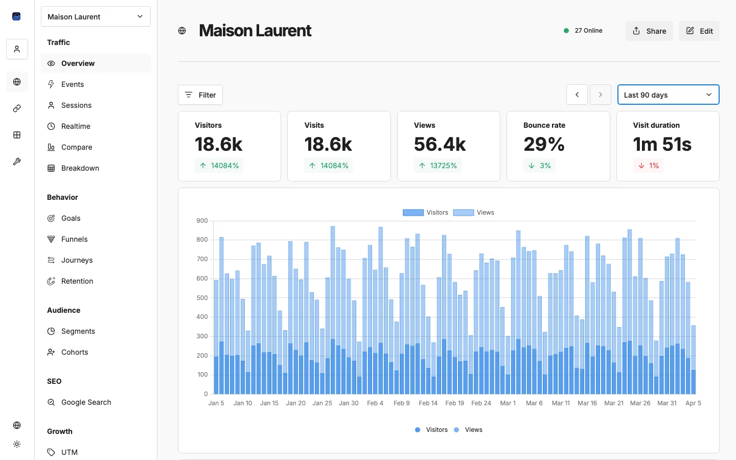
- Visitors: Unique people who visited your site
- Visits: Total sessions (one person can have multiple visits)
- Views: Total page views across all sessions
- Bounce Rate: Percentage of visitors who left after viewing just one page (lower is generally better)
- Visit Duration: Average time a visitor spends on your site per session
Each card shows a comparison indicator: a green or red percentage showing how this metric changed compared to the previous period. For example, if you’re viewing the last 7 days, the comparison is against the 7 days before that.
Date Range and Filters
Above the metrics bar, you’ll find the controls that shape what data you see:
Date Range Picker
Click the date range to choose from preset periods or set a custom range:
- Last 24 hours, 7 days, 14 days, 30 days, 90 days
- Custom date range
- All time
Use the arrow buttons (← →) to quickly move to the previous or next period.
Comparison Mode
Want to see how this week compares to last week? Enable comparison mode:
- VS Previous Period: Compare against the immediately preceding time window
- VS Previous Year: Year-over-year comparison
When enabled, a second data set appears on the chart as a contrasting line, making trends easy to spot.
Filters
Click the filter icon to narrow down your data by any dimension:
- UTM parameters (source, medium, campaign)
- Browser, OS, device type
- Country, region, city
- Page path, referrer
- Custom events and tags
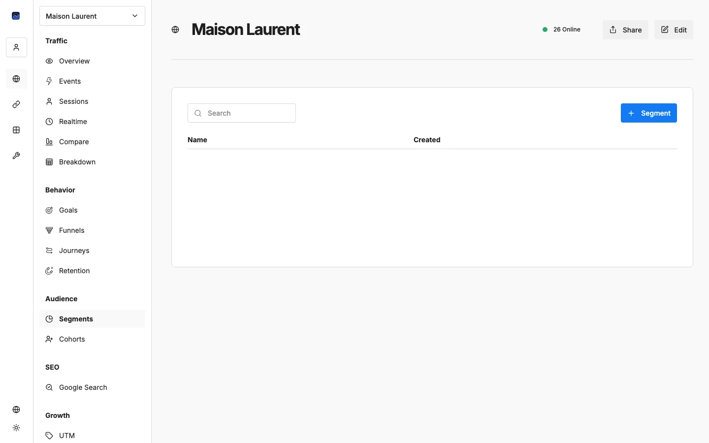
Active filters appear as removable chips below the controls. You can also save a filter combination as a Segment for quick reuse.
Traffic Chart
The main chart shows your traffic over time:
- Blue bars: Visitor sessions
- Orange bars: Page views
The time resolution adapts automatically: hourly for short ranges, daily for weeks, weekly or monthly for longer periods.
When comparison mode is active, additional lines overlay the chart to show the comparison period.
Pages Panel
This panel shows which pages your visitors are viewing, organized in three tabs:
- Path: Most visited pages ranked by page views. See which content is most popular.
- Entry: The first page visitors see when they arrive. This tells you where people “land” on your site.
- Exit: The last page visitors see before leaving. High exit rates on key pages might signal a problem.
Each row shows the page path, visitor count, and a percentage bar. Click View More to see the full list.
Sources Panel
Understand where your visitors come from:
- Referrers: Specific websites that link to yours (e.g., google.com, facebook.com, linkedin.com)
- Channels: Traffic grouped by type:
- Direct: Typed your URL or bookmarked
- Organic Search: Found you via search engines
- Social: Came from social media
- Referral: Clicked a link on another website
- Paid: From paid advertising campaigns
- Email: From email campaigns
Environment Panel
Know what technology your visitors use:
- Browsers: Chrome, Firefox, Safari, Edge, etc.
- Operating Systems: Windows, macOS, iOS, Android, Linux
- Devices: Desktop, Mobile, or Tablet
This data helps you prioritize which browsers and devices to optimize for.
Location Panel
See where in the world your visitors are:
- Countries: Top countries by visitor count
- Regions: States or provinces within countries
- Cities: City-level granularity
World Map
Below the panels, an interactive world map visualizes your visitor distribution geographically. Darker colors indicate more visitors. Hover over any country to see the exact count.
Weekly Traffic Heatmap
This heatmap shows when your visitors are most active, broken down by day of the week and hour of the day. Each cell’s intensity represents traffic volume for that specific time slot.
Use this to:
- Find the best times to publish new content
- Schedule email campaigns when your audience is most active
- Identify off-peak hours for maintenance
Active Users (Live Counter)
In the website header, you’ll see a small green indicator showing the number of currently active visitors on your site. This updates every 60 seconds and gives you a real-time pulse of your traffic.
Sidebar Navigation: Going Deeper
The Overview is just the starting point. Use the sidebar navigation to access more detailed views:
Traffic
- Events: Track custom actions (button clicks, form submissions, downloads)
- Sessions: Browse individual visitor sessions
- Realtime: Watch visitors arrive and navigate in real time
- Compare: Side-by-side period comparison
- Breakdown: Slice data by any combination of dimensions
- Pivot: Cross-tabulate two dimensions (e.g., Source × Landing Page)
Behavior
- Goals: Set up and track conversion goals
- Funnels: Build multi-step conversion funnels
- Journeys: Visualize user navigation paths
- Retention: Measure how many visitors come back over time
Audience
- Segments: Create reusable audience filters
- Cohorts: Group visitors by shared characteristics
SEO
- Google Search Console: Search queries, top pages, and indexation status
Growth
- UTM: Campaign parameter analysis
- Revenue: E-commerce and transaction tracking
- Attribution: Which sources drive your conversions
We’ll cover each of these in detail in upcoming guides.
What’s Next?
Now that you understand your dashboard, explore these next steps:
- → Tracking Custom Events: Go beyond page views
- → Setting Up Conversion Funnels: Track your sales pipeline
- → Connecting Google Search Console: Add SEO data to your analytics
Need help? Reach out to us at support@eurometrics.eu.